Pages

Monday, September 16, 2013

The Story of Thick & Thin

With more than enough leftover supplies from the Carta Bella Hello Again collection from the Paper Stories shop I went ahead and made another layout. Remember how I said at the beginning that I thought perhaps the black paper would make an interesting background? Well I couldn't get that thought out of my head, so this is what I did....


Contrasting against the black & white background I wanted lots of bright coloured papers (all my 'scraps') and I used up quite a few of the Element Stickers too. I thought I better stick to a black & white photo with all that going on and even though this one is pretty ordinary in quality it makes up for it in sentiment.


The photo shows me with 2 of my colleagues. We were all posted to work at the same hospital around about the same time. There's been lots of ups and downs over these last 3 years but I can always count on these girls for support, and that means the world to me. The title of my layout "Through Thick and Thin" reflects that idea.


There was a sticker in the Elements sheet that read 'thank you for being a friend' and it worked perfectly here, and even one of the Ormolu Flair Buttons had a cross on it which reminds me of hospitals so it also found a home on this layout. I think it's great when your embellishments are pretty, but I think it's even more awesome when they help symoblise the overall theme.


Photobucket

Saturday, September 14, 2013

The Story of Gold Doilies (and the WINNERS!!!)

My giveaway ended last night so it's time for me to pick some winners. But I can't let a post go by without sharing a little project, and since it's been all about the fabulous new JBS products, and given we're in birthday mode at my house today I've got a Birthday Card to show you.


This was up on the JBS blog earlier and features my favourite new release - those awesome gold doily rubons. Jenni has the best rubons for sure. They are so easy to apply, you can even just rub them on with your fingernail and they'll come out smooth and complete every time.


For my card I applied the gold doilies to vellum so I could cut them out and pop them up for some extra dimension. Then I layered on a button, a sequin and a red pearl for the total blingy experience to suit the celebratory mood of the card.


Speaking of celebrations, here's 2 ladies that should be getting a little excited right about now....

The winner of Giveaway #1 (the August JBS Papercrafting Kit) is.... Kaitlynne Roile
and the winner of Giveaway #2 (the exclusive new JBS products) is..... Kiranmayee Karumuri.
Can the 2 lucky winners email me your mailing addresses and I'll get your prize out to you ASAP. 
Photobucket

Monday, September 9, 2013

The Story of Crazy Like

Two Things.....
1. Have you entered my JBS September Spring Giveaway yet? There's still a couple of days to enter!
2. I've got a new(ish) video up on YouTube about the making of this layout.. let me share it with you :-)


I've got some cute kids right?.... but man do they do some crazy stuff sometimes! At this point I'm finding the simplest day-to-day activities and things they say is the best fodder for layout topics. It doesn't always have to be about the big events. So I took this quote from my daughter and based my whole page around it. She looked at this photo of herself in her pretty new dress riding on the back of a tricycle and exclaimed "that's not very lady-like... that's crazy-like", which totally made me giggle out loud!


My page focuses on the pretty papers in the Carta Bella Hello Again collection which are available at Paper Stories. In fact, I've hardly used any other embellishments. But what I have used are a lot of background mixed-media products and techniques and it's this process that I wanted to highlight in my video.


I know the idea of adding things like gesso, mists, Gelatos and Twinkling H2O's to your page sounds a bit foreign and scary to some of you, whilst others will embrace the idea whole-heartedly and might just want some fresh inspiration. I think these wet mediums are awesome for adding another layer of depth and dimension and you can still add all your paper layers over the top like I have.


My video speeds through fairly quickly (otherwise it would take forever in real time!) so if there's anything you didn't quite catch or any questions about what I've used or what I've done feel free to leave them in the comments and I'll get back to you ASAP.

Photobucket

Saturday, September 7, 2013

It's GIVEAWAY time!!

The sunny Spring weather is hitting and it makes me happy! Happy enough to put together a new giveaway. This time it's all about Jenni Bowlin Studios!


For Prize 1 (above) I'm going to giveaway the whole August JBS Papercrafting kit. I'm afraid because of postage costs I'm going to limit this to Australian addresses only.

Each Papercrafting Kit Contains the Following:

  • 3 double sided pattern papers from Fancy Pants
  • 2 double sided pattern papers from Echo Park
  • 2 double sided pattern paper from Lily Bee
  • 2 double sided Exclusive Mercantile Papers
  • 2 sheets of Bazzill Basics Cardstock
  • 1 sheet of cherry print embossed Coredinations cardstock
  • 1 package of JBS Gold Tiny Trims Revised Rub-Ons
  • 1 package of JBS Flashcard Mini Decks - To Do
  • 1 sheet of Jillibean Alphabean Stickers
  • Mercantile Exclusive - Clear Stamp
  • Mercantile Exclusive - Stencil
  • 3 loose JBS Speech Bubble flatbacks - Happy
  • several pieces of Maya Road Mini Heart Confetti
  • 1 Fancy Pants square label cork sticker
Trust me, I've got this kit myself and it absolutely rocks. You can see a recent layout and card I made with the kit on the JBS blog here.


And because I would never leave my International friends out of the picture I've put together a special giveaway for them too. Prize 2 (above) contains two packets of the new gold JBS rubons, a minideck set, and an exclusive JBS Stamp and Stencil. You can only get these exclusive items in the kits, you won't find them anywhere else.

Here's what you have to do to enter:

a Rafflecopter giveaway
Photobucket

Wednesday, September 4, 2013

The Story of Airlie Beach


I couldn't help but play along with the 87th challenge issued by CSI: Colour, Stories, Inspiration once I saw the colour scheme.  It's really interesting right? So it starts out with an obvious combo, one I've tried many times before - pink, aqua and grey. But then they throw in this avacado green at the end and it puts a whole new spin on things. It totally took me in a new direction, and instead of focusing on the pink like I normally would I ended up using that more as an accent colour whilst I concentrated on the cool tones of the green and grey.


The overriding theme for August was one of travel, so I dug out one more holiday snap (you must be pretty sick of them by now!) and got to work. I realised I had never actually documented the whole reason for our holiday in April. I have made plenty of layouts about the things we saw and did (here's just a few examples here, here and here) but I never explained why we went on holiday in the first place.


You see, it wasn't planned at all. Not until literally one week before we left. What happened was that one of my doctor friends was planning a holiday with her husband in Queensland to attend a wedding. But when she booked her accommodation with the hotel she accidentally booked the same hotel branch in Airlie Beach, instead of the location she was actually going to. Whoooppps! And then the hotel wouldn't refund her money, or transfer the booking across to where she wanted to go. A few choice words later she didn't have any resolution but was now stuck with a 2 bedroom luxury apartment booked for 5 days under her name and no way she could possibly use it.


Well, what was a friend to do but step in and offer to help her out and take it off her hands! It's not often you get an opportunity like that thrown at you. So I swapped a couple of shifts around, did a few favours of my own and hey presto - next thing we knew the whole family was flying off to tropical Queensland to enjoy a week by the beach. It was just perfection!


PS. I was surprised and amazed to see I had made the 'Most Wanted' list for the last CSI challenge, which was actually the first one I had participated in. It's not why I do these things, I truly do it to push myself and challenge myself. But it doesn't hurt! I blogged about that page here.


Photobucket

Monday, September 2, 2013

The Story of the Mustache Flair

For those who were celebrating, I hope you had a fabulous Father's Day yesterday. It was such a lovely spring day in Melbourne, and here in the Elphie household we showered The Man with much love and attention.


As for the kid's grandfathers and great-grandfather, a card has been popped in the post for each of them. Made in three entirely different sittings they have managed to come together nicely as a set. I used the same collection obviously, it's the rather gorgeous Echo Park 'This & That' which has all these lovely masculine elements in it.


I rather adore the neutral colours with the teal and green highlights, and a liberal splash of gesso and white mist has given it an even more grungy feel. I added the cute mustache flair buttons from my Evalicious collection because I don't have many opportunities to use them otherwise!


A few detail shots for completion sake....
Just love those cameras :-)


Happy Father's Day!!


xxx
Photobucket

Saturday, August 31, 2013

The Story of 10 Years

I know the challenge site CSI: Colours, Stories, Inspiration has been around for a long time and I've often checked them out, but until now I haven't played along. This month though I finally found the time since my DT commitments have reduced somewhat and I made a page for Challenge #86.


Here was the inspiration piece. The colours are totally 'me' aren't they? But what I love most is the focus they have on expressing yourself through journaling and they always include prompts for what to write about as part of the criteria. I'm still going through Jill Sprott's online class "Scrapbooking from the Soul" which is also all about concentrating on telling the story so it's all coming together for me right now.


The photo I picked to scrap was one taken on our 10th wedding anniversary while we were out for a romantic dinner. We actually went on a long-weekend away (sans kids!) and it was a really terrific time, although we missed them terribly of course!


Taking my cue from the photo I then chose to journal some of the reasons why I love my husband. One of the criteria for the challenge was to pick a journaling prompt from this list by Ali Edwards (I picked #12). I'll definitely be keeping this for future reference - there's 12 other great prompts on there too!


When I'm faced with a colour challenge I tend to go through piles of my stash and pick out lots of bits and pieces that will coordinate. It often turns out that I throw a whole bunch of them on my page in random arrangement, and most of the time they're older products or things I've often overlooked before. It feels good to use up stash like this! But I had a whole 'eureka' moment when I saw that empty Sassafras alphabet sticker sheet in the right colour and realised I could use it to represent our initials! "M" and "N" all lined up down the bottom of the sheet.... it was perfect!!


And the little pink foam dots? They're the leftover pieces from a sheet of foam Thickers - they're all the extra dots for the top of i's but I'll never use them for that purpose and I've nearly finished the sheet otherwise, so I sprinkled 10 of them across the page to represent our 10 years together.

I'm already looking to the next CSI challenge to try and play along again!

Photobucket

Sunday, August 25, 2013

The Story of the Basics

I've learned something about my style recently. I actually realised for the first time that my favourite background paper is one that is white/cream/vanilla in colour with a subtle pattern such as grids, lines or distressing. The incident that brought this to my attention was when I finished off my pad of Basic Grey Basics Manilla collection. Do you remember it? Released about 3 years ago (or more?) it was the perfect collection of what I just mentioned.


I thought I would share with you some of the layouts I've made over the past years with the collection so you can see just what I mean. I'm sharing them here in reverse chronological order. You've seen this first layout here fairly recently, (and also over at the Paper Stories blog).


But now that it's gone I've got my sights on the Simple Surfaces collection that Cosmo Cricket just released at the last CHA. I think it's going to be perfect for me!


Photobucket

Thursday, August 22, 2013

The Story of Name Calling

I can honestly tell you I've been having such a fun time creating with the Hello Again collection from Carta Bella that's currently available in the Paper Stories store. I'm not sure that I had used Carta Bella before the lovely Georgia sent me this kit, and maybe you're in the same boat? Let me tell you the quality of these papers is fabulous! Do you remember the old Crate Paper, or the older My Mind's Eye papers that were thick and soft and velvety? That's what these are like.


For this first layout I've limited myself to only using the yellow, pink and black papers. When I'm faced with an entire collection I find it a little daunting to know where to start. For example, there's way too many fun tags and stickers to choose from! But if I make up a colour scheme to follow it helps me make choices about which ones to use.


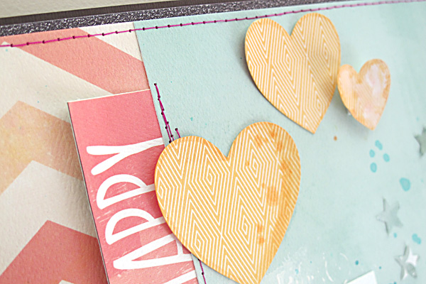
I started my layout by cutting out a bunch of hearts into my background paper with my Silhouette. I backed it with a contrasting colour and made sure to stick some foam tape in between the layers to give it some depth and dimension. That's a little technique I've been playing around with lately and I'm really loving the results. I've made another page using this style but it's been picked up for publication by Scrapbook Trends (yep - shameless name dropping here!)


And of course, the cut-out hearts don't go to waste because I've used some here, and the rest ended up on my next layout! I've just doodled around them a bit with black and white pens.


Because most of the decoration on this page was done with the hearts I didn't need a lot more embellishments, but I've layered up some of the Element Stickers plus the Label and Flair from Ormolu which match perfectly. The title stickers also worked well as they continued on with the black & white theme. You can find these JBS stickers in the shop too (on sale!!)


This layout is all about the day my youngest finally called her sister by her proper name. You know how young kids tend to turn long difficult names into funny little abbreviations? Well it's taken my almost-4-year-old that long to be able to call her sister 'Bethany'. Mostly she calls her 'Bebesh'. It's partly our fault too of course, as we rarely call her Bethany either. She's got about a million little nicknames that we call her instead. It's just a family moment in our everyday lives that seems worth documenting :-)

Photobucket

LinkWithin

Related Posts with Thumbnails