It's Reveal Day at Studio Calico and the new
December Park Ave Kits are now on sale. Here's a look at the
Main Scrapbook Kit to get you in the mood for what you might expect....
How would I describe this kit in one word? Vibrant!
The colours in this is what really grabs your attention and sparks the imagination. And that splash of purple dotted throughout is really unique and massively awesome if you ask me. I know it's not everyone's cup of tea, but I think it makes this kit stand out above the rest and adds an unexpected element in an otherwise more traditional colour scheme of pink, teal and white.
And here's a real-life walk though of what it looks like in person, as well as the 3 Add Ons... as described by the Trophy Husband and Moriah. What's he going to say this time? I honestly have no idea - I actually haven't even watched it this time around. So you're in for as much a surprise as me!
Here's what I've done with
Park Ave...
Obviously I'm inspired to scrap some Christmas pics at this time of year, and I've got such a backlog from the photos I took last year that I'm starting there!
This layout came together really quickly once I started working with the
Digital Templates that Shanna Noel designed this month. They're technically supposed to be used as card templates for your Project Life albums or Christmas cards, but I wasn't the only one on the Creative Team that couldn't resist the temptation to blow this up to an 8.5 x 11" size and create a layout with it. They're super cute aren't they?
I've used the one on the left for another layout I'll share later on in this post too.
But whilst I was perusing the
digital shop I came across something else that immediately had me wanting to put together a certain layout. Here's what I was inspired to make...
I'm sure all of us as parents have that massive pile of kid art that we've been given that we're expected to keep forever. I love my kids and I love their art. In fact I've even got a hashtag on Instagram where I help catalogue it all (
#ElphieKidsMakeStuff) But in all honesty it's just not possible! There
are those special pieces though that you really do want to treasure and I've been trying hard to help incorporate them into my own layouts and PL spreads as a way of immortalising them.
So when I saw the
Project Life Digital Stamps with their crafty vibe I knew they would be perfect to create another page featuring some spectacular kid art ;-) Because I already had the photo printed off I chose to convert the stamps into cutting files instead and used them here for my title and the scissor embellishments.
Because the
Main Kit was packed with so many things I
wanted needed to use I was able to very easily whip up a third 'Main Kit Only' layout - this one inspired by my very favourite paper, the colourful one with all the houses on it.
Yes it's true, sometimes a single product can steer the whole direction of a page! So I started with the house paper and the idea that I wanted to journal about this wonderful city of Melbourne that I live in, and then everything started coming together. First I noticed that one of the
Printable Journaling Cards included a quote about a city, and then I also saw the chance to create a skyline of high-rise buildings with the
Card Kit Digital Stamps converted into cutting files (again!)
But as much as I love the
Main Kit I also couldn't wait to get stuck into the Add Ons. They are just gorgeous. I'm really finding it hard to chose a favourite, and think I should give up altogether. Check them out...
I started working with
Ritz, added in some papers from the
Main, and then the embellishments from
Waldorf (namely those cork snowflakes that everyone on the CT is raving about). Because I just
had to work them into a layout somehow, so I made this page about Moriah's latest obsession with the movie Frozen. Totally works right?
Lots of journaling on this one - documenting the events of her birthday just gone. Because I feel like I'd been a bit slack with the amount I'd written on some of the others, so I over-compensated! But it tells the story, and that's what it's all about for me.
The photos scored a bit of digital love in the form of some stamps from the
Lizzy Birthday Set which obviously suited the occasion perfectly. I'm seriously considering knabbing the acrylic set for some real-life stamp action because these would make some cute birthday cards don't you think?
Or if you're in the mood for birthday scrapping, there's also
an alternative set that's a bit more funky, called
'Happy Something'. Love the brush script on this one. Another difficult decision. Might just get them both ;-)
My last layout for the month was another hybrid attempt. These
Digital Templates will make it so much easier and quicker to get some Christmas scrapping done in the busy season. And I'm ridiculously in love with the bright colours and ability to add so many photos on this particular template.
Although I didn't find the space to add any journaling, I think having 6 photos is probably enough to get a good sense of the story behind the occasion. It really captures the essence of the happy event doesn't it? And I've managed to get 90% of the family on the one page which is usually quite a remarkable feat for our gatherings!
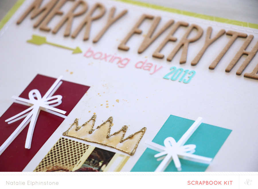
Being a Christmas layout I couldn't resist the temptation to add some gold touches - especially since we're all wearing gold crowns in the photo. I created my own hand-drawn versions with
Gold Glitter Zing and coloured in with
Gold Mister Hueys. Loving the sparkle this adds.
And if you're thinking you love gold as much as I do, and you're fascinated with the latest craze of scratch off cards, then you might want to check out this
'Upcoming Year Card Set' designed by Marcy Penner. I could easily see these being used as a little desk calendar, or in my Project Life album.
And that's my lot for the month. And for the year really. I've still got one or two little projects coming to various blogs during December which use these kits, but ultimately this is the end of the line as far as the current CT are concerned. Who will be around next year, and what 2015 holds is yet to be announced. I think we're all holding our breath on that one! But I don't think it will be long before announcements are made.
In the meantime.....
Happy Scrapping!