Pages

Saturday, November 30, 2013

The Story of Her New Do

I was super-chuffed to have this layout requested for the Imaginarium Designs blog before it had even dried on my scrap table! I shared a little sneak on my Instagram, and apparently that was enough to convince them ;-) The post with this layout and another card went live earlier in the month, and you can see it here.


It's true that the fabulous Imaginarium Designs chipboard feather became a focal-point of my layout embellishment. It's quite something isn't it? I absolutely adore it, but if I can be honest... it actually wasn't planned for this layout at all. It was destined for a card project that just wasn't working for me, so off it came.


There it happily sat on my scrapbook desk in a pile of similarly (discarded) embellishments waiting for the perfect project to come along. It experimentally made it's way onto many more layouts, trying it out this way and that way to figure out where it would fit but to no avail. And then in a frenzy of creative passion I started piecing this layout together with all that was surrounding me at the time, and the feather found a home at last.


Does it represent anything in this layout's story? Nope, don't think so. It's just pretty. Same with the deers. I really like deers, they're definitely my Christmas icon of choice, but for this layout they really have no clear purpose or direction, apart from the fact I like them! Perhaps it would be easy enough to suggest they represent a mother and her offspring, or that I think of my daughter as my 'dear-est'.
Yeah. Let's go with that!


The story of this one is how my youngest insisted on getting a hair cut recently. It's only the second one in her 4 years so as you can imagine her hair was quite long. But without hesitation when the hairdresser asked her what she wanted she replied, "I want my hair all cut off like Mummy". Well we didn't quite go as drastic as that and settled on this cute bob-cut instead, but I was rather chuffed at the idea she wanted to emulate me :-)

Photobucket

Wednesday, November 27, 2013

The Story of Autumn Days

Continuing on with my projects made with the Jenni Bowlin Mercantile October Papercrafting Kit, here's another layout I wanted to share with you here...


The colours in the kit were geared towards Autumn, and even though we're very nearly in Summer here I couldn't help but go along with the theme anyway. I mean, lets be honest, there's a pile of photos on my scrap desk still waiting to be scrapped that span back many years so it was easy enough to find some seasonal photos that would match.


The first thing I did was break open the ol' Cuttlebug and cut some leaves into the bottom portion of my page. Obviously I could have used my Silhouette for this, but the poor Cuttlebug has been quite neglected of late so I thought it only fair to share the love around ;-) A little sprinkling of the sequins in the kit and they found their way into the negative shapes almost by magic.


Autumn memories for us this year included our annual Easter trip up to the farm, hence why Moodles is wearing rabbit ears in the photo (in case you were wondering!!) I included my journaling on a hidden tag tucked behind the photo as I find it more challenging to find space for all my writing when I do these 8.5 x 11" layouts.


And before I go I wanted to share with you a special offer that's almost ready to expire at Jenni Bowlin. For this month only if you sign up for a new subscription you'll receive a past kit or add-on kit for free!


With all the new exclusives included in the kits there is no better time to subscribe, but you better hurry because it runs out at the end of November!!


PS. If you mention you're signing up because I referred you... I'll get a free kit too!! ;-)

Photobucket

Tuesday, November 26, 2013

The Story of Thanksgiving

November is a great month for reminding ourselves to be more thankful of the blessings in our life right? And even though we don't celebrate Thanksgiving here in Australia, I find that it's still such a fabulous reminder to take the time and get a little bit of perspective on some of the things we might otherwise take for granted. 


Munchy is 7 now, and is at that stage where she really loves to write things down. She writes little stories, and lists of things she wants to remember, and letters to her grandparents and so on. This month on the Jenni Bowlin blog the DT members have been sharing the different versions of their gratitude albums. It inspired me to decorate a version of the same idea for Munchy to fill in.


I used the October Papercrafting Kit which is full of the Basic Grey Persimmon and Crate Paper Close Knit collections. The warm colour scheme is perfect for this heart-warming project (!!)


The inside is filled with blank pages which prompt her to think about what she's feeling and to list a few things she's grateful for. She's already filled out a handful of the pages, and trust me... she's not always feeling "fine". Here's a few of my favourites which I'll promptly translate for you since her writing is a little hard to read.

The one above says,
"I am thankful for my whole family, my washing machine and food and water. I am also thankful for clothes. Also money. Don't forget houses! I am also thankful for toys. I just adore them!"


This one is when she's angry, and she says,
"I am thankful for my school and class mates. Also my church friends including Michaela, Amber, Lara and Adah. Also I am thankful for horses because they don't give stinky air like cars do."


And lastly, this one from when she's feeling super happy.
"I am thankful for my friends that care for me and that play with me. They keep secretes when I ask them to. I am also thankful for God and Jesus. And the roof over our head."


Not a bad effort for a 7-year-old right? I love the sweet innocence and sincerity of these.
What are you thankful for?


Sunday, November 24, 2013

The Story of my Fave

If you didn't already love the new Maggie Holmes Flea Market collection then it's probably because you haven't discovered the gold doily vellum yet ;-)


There's 3 things that make this particular product a hit. One - it's vellum, which makes it awesome for layering. Two - it's in a doily print, and everyone loves doilies. And three - it's shiny shiny gold, which is the hottest colour trend of the moment!


Using the vellum doily as a base I built up a few more layers of tags, string and a real doily for added texture and dimension.


And in case you're wondering, I gave this card to my sister for her birthday. Yes, she is my only sister!

PS. I've drawn another winner for my October Afternoon RAK which I'm attempting to give away as part of the Frosty Festivities because the last winner hasn't contacted me yet.
So a great big congratulations to JANIS who is my new winner!!
Janis, can you please email me your postal address and I'll get your prize in the mail ASAP. 

Photobucket

Thursday, November 21, 2013

Tutorial: Working With Neutrals

This post first appeared when I was a Guest on the Scrapbook Creations blog last month. You can check it out here.

Neutral colours include all the tones along the black, grey, white spectrum as well as browns and creams. Neutral colour schemes are a big trend right now, but it can be hard to get it right. Without some simple tips and tricks in mind your layout can end up looking very monotone and dare I say it, boring?! Here’s some pointers to keep in mind.


1. Texture is the Key

When working with a limited colour scheme it’s important to create interest in other ways, and the way to do that is to include as many different textures as possible. On my layout I’ve included plastic, metal and wooden embellishments which all have a different visual appeal to them. Even my patterned papers have variations in their texture – smooth cardstock, crumpled ledger paper and the embossed hearts.


2. Layer Upon Layer

Along with texture you must have dimension. Make the viewer want to reach out and touch your layout by having certain elements jump right off the page at them! If the photo is your focus point then create a sense of depth around it by layering up loads of paper, tags and embellishments. You can use foam tape or the embellishments themselves to create the depth in between layers.


3. Create Contrast

The eye is drawn to areas of high contrast, so even though the majority of my layout is beige, cream and white I’ve added some important highlights in black which create quite an impact. These should be kept to a minimum though or else they risk overpowering the effect. Similarly you’ll notice a few teal embellishments and paper amongst my otherwise neutral scheme. This colour was carefully chosen as it’s soft enough to blend in whilst still creating a splash of contrasting colour.


4.  Use White Space

White space doesn’t need to be white (although in this case it is!) White space is simply an area on your page with minimal or no embellishment that allows your eyes somewhere to rest. Whilst it’s great to have clusters of embellishments and layers of paper make sure these don’t fill the entire page or it can be very overwhelming. On my layout I’ve left space down the bottom of the page that’s my designated white space. I too fight the urge to embellish it and you can see I’ve added a few rubons, but that’s ok because they’re quite subtle.


5. Photo Choice

You don’t necessarily need to chose a black & white photo but you’ll certainly want to chose one with a fairly neutral colour scheme of it’s own. Mine was a sepia print because it worked better with the dominating colours of brown and cream in my layout. But you could still have a colour photo as long as didn’t have any bright tones in it.

Well I hope I have given you some inspiration today and a few tricks on how to work with neutrals. If you give this a go please link up your projects in the comments, I would love to stop by your blog and see them.


Photobucket

Monday, November 18, 2013

The Story of the Strawberry Milkshake

I woke up to some extraordinary scrappy news today. The kind that brings a little squeal of excitement. But of course, I can't share it yet. Sorry! What I can tell you is that I'm also very excited about having another opportunity to be a Guest Designer for Scrap Friends' November Colour Challenge. Here's what I created...


Man was this colour challenge a little out of my comfort zone!! All those dark colours? Eeek! I tend to be either a brights or a pastels type of girl! I have to admit I had a mini-breakdown when I saw the colour palette because my mind just went blank as to what to do with it.

After I gathered myself I did what I always do with colour challenges and that's to start going through my stash and pulling out bits and pieces that match the colours. I don't think about collections, or what's going to match with what. I just want the right colours.


Often I find some real gems of forgotten products that probably wouldn't have seen the light of day otherwise. Like these Cosmo Cricket peacock feather stickers that have been in my collection for well over a year now (possible even 2) waiting for the perfect project. Today was their lucky day! They ended up becoming the real star of this layout don't you think?


I mixed in a few new products too, like the transparent Basic Grey die-cuts and Evalicious Stickers. And do you see that there on my page? Yes folks.... that's a flower! I did it! I managed to use a flower on my layout. So proud of myself!


The photo choice almost came last as I needed something that would match all these dark colours. This one of Miss M sipping on a strawberry milkshake suited perfectly. The fact that her polka-dot dress coordinated with the dark polka-dot paper actually came as a bit of a coincidence but I definitely embraced it :-) I used the photo to then prompt my title and journaling direction and made it into a list of her favourite foods right now. Nothing world-shattering but still a snapshot in time that will be worthwhile remembering later.
If you want to play along with the challenge there's a store voucher up for grabs for the winner. Find all the details on the Scrap Friends blog here.

Photobucket

Saturday, November 16, 2013

Scrapbook Creations Issue 102


is on sale now.... and it seems I've managed to score myself another cover! Always such a surprise and amazing compliment. Geez listen to me... like I have covers all the time! I certainly don't! This is only the second time, and I'm also sharing the honour with a few other people. Can you guess which project is mine?


It's the Christmas tree centrepiece ;-) And here's another little sneak peak of it up close.


If you're a regular subscriber to this magazine you're going to notice quite a few changes in the format this time around. Editor Ellen continues to do amazing things, and one of changes includes making the gallery layouts into full double-page spreads. That allows plenty of detail shots to be included too which I think gives you so much more perspective into the texture and dimension of the piece. Here's an example of what I mean....


I was lucky enough to have one of my layouts featured and this is one of the amazing detail shots taken by the talented Amanda Reddicliffe that appears in the magazine. I'm kinda impressed myself looking at this!! LOL!

There's plenty of other new features too. I suggest checking out the Christmas Issue for yourself on the Scrapbook Creations blog :-)

Photobucket

Friday, November 15, 2013

The Story of the Busy Christmas

Did you know Jennifer also has 4 challenges going on (with fabulous prizes involved!) as part of her Frosty Festivities? Be quick though because they close on the 17th ;-)


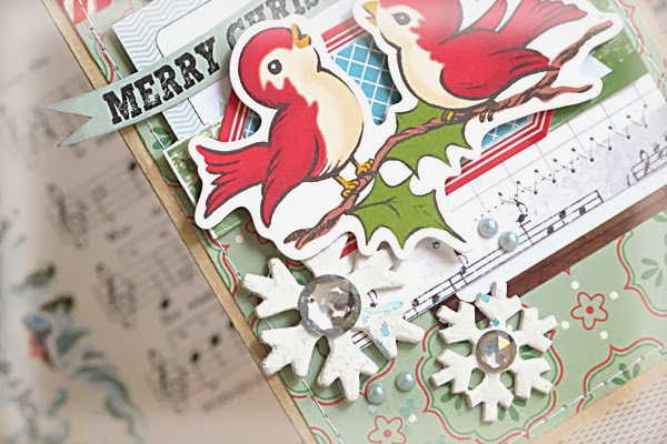
I've been able to whip up this card for the "Embrace the Busy" challenge which is all about creating something with a busy photo, or busy patterned papers, or lots of busy embellishments. I'm personally a bit prone to the crafting symptom of not knowing when to stop so I figured this was the challenge for me! If I'm not quite happy with how something is looking I just keep on adding things hoping that will solve the problem. I very rarely ever take anything away ;-)


And that's what happened here. I began with a basic design of a couple of Evalicious tags over some lovely October Afternoon paper. That was obviously not going to be enough.
So I added the stamped sentiment (which is from Evalicious' new Dear Santa stamp set) and that was ok, but it still needed more. And that's where is started to go pear-shaped.
You see, I also tried to stamp onto the red tag but it was the wrong colour and it didn't stamp properly anyway. So I covered it up with the blue paper and stuck the birds over it to try and hide it all!!


Then came the snowflakes just because they were left-over from my last Christmas project. And the pearls and rhinestones to finish it all off because all cards need a bit of bling surely?!

So yeah... I think this card qualifies for the challenge "Embrace the Busy" don't you?

Photobucket

Wednesday, November 13, 2013

The Story of Shaking Your Groove Thing

Sometimes you've just got to keep it real.


Even when it includes making challenge layouts that revolve around cute little tooshes!

 
I'm loving the Jot Mood Board challenge with it's vibrant magenta and gold contrasting against the cream and white space. With these bold colours on a layout I knew I was going to have to be careful about my photo choice so that it didn't clash. I have to admit, I'm normally someone who chooses what papers they want to work with first, but on this occasion I started my layout by choosing my photos.


I picked this series of photos I took of the divine Miss M because of the skirt she's wearing (I thought it would match the magenta). First she posed for me, then she proceeded to tuck her wand into her 'pocket' so she could dance. It was the dancing that did it though because before I knew it she was turning her back on me and shaking her bottom in time to her song. She likes to bend over a bit for dramatic effect ;-)


In fact, she even has a little song that goes with this particular dance. It's very sophisticated and really just repeats the line "shake your bum-bum, shake your bum-bum" as she does her little wiggle. She knows she's being a bit rude so she tries to put on a funny voice (which granted... does make me giggle every single time) but which also has the effect of making her pronounce the word bum 'boom'. Now you understand both the title, and why I put a question mark under the cuteness sticker!


Because there were 4 photos in this series I thought about either including all of them spread out across my page or leaving some off altogether. I didn't really fancy either of those two options so I came up with a third. It involved turning them into a little mini-book of sorts and including the whole thing on my layout! I made each page out of vellum and included just a few embellishments so that when they were all stacked up on top of each other you could still catch a glimpse of what's underneath.


The other benefit that came with making a little mini-book was that it also gave me lots of room for journaling so I could try and explain these photos in a bit of depth without it taking over the whole page. I used every available space!


Yep, sometimes you've just got to keep it real.

Photobucket

LinkWithin

Related Posts with Thumbnails