Pages

Monday, September 29, 2014

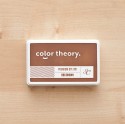
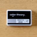
The new Color Thoery colours

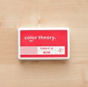
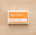
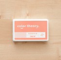
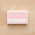
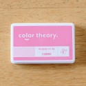
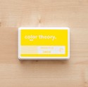
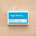
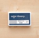
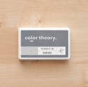
Last month Studio Calico introduced the 6 new members of the Color Theory family in ink form. They were a welcome addition to my colour-loving home :-)


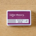
And if you weren't hanging out just to see what the colours were, you were certainly waiting to see what they would be called. Am I right?! My kids think I'm crazy because every single time I pull out my Purple Rain ink pad I find myself singing the song. They have no idea what I'm talking about. They need a proper education ;-)


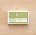
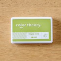
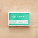
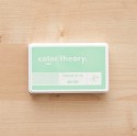
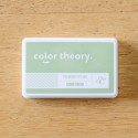
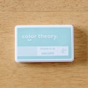
I have to admit though, with the addition of a further 3 green/blue/aqua colours in the mix, I was wondering how they were going to compare with the greens that were already in my collection from the original release (Mint Hint, Yes Peas and Emerald City). So I thought I'd do a side-by-side comparison.... and then figured you might be interested as well!


Now let me just say that I am in no way a colour expert. I have never taken any art classes, graphics courses or whatever it might take to call yourself one of those. Oh hang on, that's a lie... I did take Lisa Truesdell's "Color Studio" class earlier in the year... so maybe I do know a thing or two!
But the way I would describe the new greens is that Going Green is more your lighter grass green, Glass Slipper has a touch of blue so is probably described as a pale aqua, whilst Lime Light is a vibrant yellowy-green.
 

And since I was on a roll, I thought I'd do a little chart for the pinks and purples as well!
Flamingo and Purple Rain are the new additions and as you can see they don't really compete at all. Both of these are nice and bright and have quickly become some of my new favourites. I've already used these a lot, and Flamingo especially made it onto many of my October kit layouts.


I should also point out that I'm not a stamping expert either. I wasn't aiming for these samples to be perfect, I simply wanted to compare the colours and to see how they worked with a solid image, outline image and words. I've used the stamp set out of this month's Notting Hill Add On and stamped them onto watercolour paper (which is not a true bright white). But it does the job and I think I'm going to be referring to these a lot in the future.

Photobucket

The Whole Collection (so far.... !)


Sunday, September 28, 2014

The Underground Reveal


The Underground is name of the latest kit offerings from Studio Calico and as usual they are just brilliant.


Here's the walk-through of the Scrapbook Kit and all it's Add Ons as directed by The Girls. It was Moriah (aged 4) who wanted to take the lead on it this time... which worked well for a few moments, but the natural bossiness leadership of her big sister meant it soon changed direction. They had fun though!


The Main Scrapbook Kit is filled with the warm colours of forrest green, brown and gold - perfect for all your Autumn scrapping. But I wanted needed to take my layouts in an entirely different direction since I'm all excited about the sunny Spring weather we've been having, and far from being difficult, I actually found it very achievable.


First up is my double layout for the month. I thought it might be an extra challenging to do my double using only the Main Kit but honestly there's so much potential in the kit with lots of different combinations and theme possibilities that I simply just went with a bunch of my favourite patterns and threw this together in no time at all.


The 'Make Magic' title is made using the Silkscreen which is included. If you saw my video on the SC blog last month then you'll know that there's a million ways you can use Silkscreens. On this layout I went with a very simple method of using it with a spray mist. The interesting thing was that I didn't have a mist in the particular shade of bright blue I was after, so I made my own by adding a few drops at a time of Something Blue Ink Refill to a bottle of water until I had the intensity I wanted.


And oh my! Those giant Silhouette-cut clouds that Paige Evans designed are destined to become a new favourite for sure. I thought I'd make a feature of them on the second half of my page and just let this side be for decoration and a bit of journaling rather than adding more photos. I was thinking they would help convey the fairytale feel of this layout.


My second Main Kit Only page was where I discovered the pink, lime, black and white combination that I was to use a few times this month (not revealing all of those projects today!) as I did my usual layering trick. I layered with the patterned paper and the book page, I layered with off-cuts of the Printables, and I had to layer in one of those pink doilies too of course.


One of the biggest challenges with my scrapping this month is that my sewing machine is in the shop for repairs. It occurs to me that I haven't made a layout without sewing on it in about 4 years! I was quite lost actually and had to come up with a couple of alternatives. Where I would normally sew around the edge of my page here I simply ruled a black line instead to give a similar appearance (and use a whole heap more double-sided tape to make sure it all stayed together!!) And because I couldn't seem to stay away from having thread appear on my pages you'll see little messy cotton clusters scattered everywhere.


Add On 1 is called Piccadilly and has the gold highlights that I've come to love recently. Those are some seriously shiny gold alphas, the b-side to the stripy paper is the pink and gold glitter hearts you see below, and that's gold paint you're spying there too. 


If you look back at the papers in the Main Kit for a second you'll see that dark brown brick pattern? What you can't see is the giant '3' that's on it as well. I took that as a prompt to make my first pregnancy layout and after I cut it out I figured that was almost a gold colour too and would work alongside the pinks and browns of Piccadilly.


I guess I should be more careful about having too much pink on my pregnancy layouts though - at least not until I actually find out whether we're having a boy or a girl!


Add On 2 is called Notting Hill and is slightly similar in colours to Piccadilly - in fact they work really well together and that's why both my "Expecting" and "Snow White" layouts are actually a combination of both kits. Gotta love the Maggie Holmes stickers, fun stamp and pastel wood drops in this one though.


When I put this layout together I started with the photo which was only taken like last week. The white space allowed me to digitally enhance it by layering one of the Printable journal cards over the top in Photoshop before I printed it. Then I used the angles in the image and the colours of the photo to guide the design of my page. 


After I stamped and cut out the flowers I added a little spray of my home-made blue mist and then dolloped on the gold paint. As in, I literally unscrewed the lid and dabbed the tube onto my paper to leave these little gold mounds of paint. Fun... and mess free!


The embellishment-only kit is called King's Cross and has more of that hot pink and lime green in it - especially in the exclusive stickers. By pure coincidence I had recently printed off this photo which has the same colours and so off I went doing that layering thing again.


The hearts in the background are stamped in some of the new Color Theory Inks - in Flamingo and Lime Light. They're definitely my new favourites! I like the vellum envelopes in the kit too, lots of potential here, and I thought about hiding my journaling away in it but ultimately went with scrawling it all over my page as you can see!


Anyway, so those are my layouts for reveal. You can check them out in my SC gallery for more details and a proper supply list.

Speaking of supplies, I know I've already shown you my shopping list for the month, but there's always more things added to the shop at Pre-Sale and so it would be remiss of me not to mention what else is in my cart ;-)


Just one steel die on offer this month... but it's fun! Here & There will be perfect for scrapbooking and Project Lifing alike.

These Amy Tangerine Kraft Stickers went immediately in too :-)

And if you've made it this far then congratulations! Just a reminder that my giveaway of all these exclusive Studio Calico goodies ends tonight at midnight AEST. You can find all the details on how to enter here. Good luck!


Photobucket

Friday, September 26, 2014

October Shopping List

My top 5 choices of things to add to your Studio Calico shopping cart this month. If you're a subscriber you will want to wait for bundling to begin of course... but there's no harm in just checking things out right? ;-)


Color Theory Ink Pads
The latest addition of 6 further colours to add to your Color Theory Ink Pad collection have been released and I didn't need to think twice about adding the whole bundle to my cart. I've certainly given Inky Black, Flamingo and Lime Light a good workout already on my October layouts. The label stickers come separately but are essential if you plan on stacking them so you can easily identify which one is which. I've now got my stack of 18 colours piled high on my desk, but they don't seem in any danger of falling.

Totally Awesome Die and Stamp Set
I know I've had the metal dies on my list for a few months running now but that's because I've fallen back in love with them recently. I used to think after I got my Silhouette that I'd never have to buy a metal die again, and in many ways that's true. But there's just something about the bevelled edge and smooth contours of a metal die cut image that appeals to me. And when that image comes with a coordinated stamp set it allows for so many possibilities. I've used this Totally Awesome set in my October projects not once but twice! It also comes with an alternate stamp set called 'Be Awesome'.

Transparency Pad
This is one of the many reasons why it pays to be a subscriber. Every month there is an exclusive SC release which is only available for subscribers to order, and this month it's a 16 page 4x6" transparency pad printed with gold foil and white designs. It's clearly awesome (pun intended!) and went straight into my shopping cart the minute I spotted it. 

Leather Album
With a new baby coming and my very first pregnancy layout having been scrapped for the October reveal it has dawned on me that I'll probably need a new album. The way my albums are organised at the moment is to have a separate one for each of the girls for each year (plus an extra one for everything else). So yeah... I'll be needing to add a new colour to the lineup and this Aqua one seems like a good neutral choice since I don't know the sex of the baby yet ;-)

Watercolour Papers
I know these aren't new to the SC shop.. but they've only recently just been restocked, and even more recently reached my eager hands. These really are as awesome as you have imagined! This set comes with 40 sheets of paper saturated with colour that readily discharges when activated with water (a waterbrush is perfect). What that means in real terms is mess-free painting! For example they've even been packed up with us on our holiday trip so the kids can augment their travel diaries.

Photobucket

Thursday, September 25, 2014

The Underground Sneaks

Studio Calico's October Kits are just around the corner and the Mood Board hints at all the typical Fall and Halloween colour schemes you would probably expect in an American kit released at this time of year. And even though I am obviously not quite in that same state of mind, it was pretty hard to resist this amount of gorgeousness...


The official Main Kit sneaks confirm what you might have imagined - lots of green, gold and brown which is altogether fabulous. And honestly, it's not like I don't still have Autumn photos to scrap, or couldn't use that type of colour scheme for something else. But having just entered Spring and having a bunch of new and sunshiney photos to scrap I wanted to go a slightly different direction.


Surprisingly, the Main Kit also contains hints of more feminine and softer colours and both of these following 2 sneaks from my own layouts have been made with the Main Kit Only.


And if you follow me on Instagram or Facebook you would have known how excited I got when I discovered this new-to-me lime green, pink, black and white combination (all from the Main Kit) and I've used it a few times throughout my five projects.


And like all good kits, if you augment with a different colour altogether you can stretch your kit into whole new territory as well. So here I added in some bright blue and it helped sell the Spring time story I was telling on this layout.


Now lets talk about the Add Ons!
Add On 1 "Piccadilly" is definitely the kit for all the gold lovers. Shiny gold alphas, sparkly gold patterned paper, and an exclusive Color Theory gold paint are all included.


This is such a pretty kit and I couldn't help but make my first pregnancy layout with it. I should be more careful though, I mean... what if this one is a boy and all these early layouts filling his album are going to be so frilly and feminine? I guess it's just because that's what I'm used to!


Add On 2 "Notting Hill" is more your clean and graphic kit with lots of classic patterns, and those darling wood veneer/enamel dot chevron pieces which have just become my new favourite.


Of course, you can always mix and match the kits and here on this fairytale layout I added in the stamp and gold paint from Piccadilly to give it a softer look.


Add On 3 "King's Cross" is embellishments only as usual and there's lots of really fun things in this kit. Those travel rubons I'm saving for after my current holiday, but the sticker sheet and washi tape got a work out on this yummy dessert page below.


Oh yeah, and I used that pink, green, black and white combination again ;-)


Now since I'm in a celebratory kind of mood I thought I'd do a Giveaway! I've got a spare September Poet Society Card Kit Paper Pack, Jar Stamp Set and wooden banners pack to give to someone lucky.

To win it, all you need to do is go over to either my One Scrappy Doctor Facebook Page or my personal Instagram account and 'Like' or 'Follow' me there (you don't need to do both, but you can if you want to!!) and then come back here and tell me which one you follow me on. There are advantages to it.... I often share things on there that never make it to my blog such as sneaks, projects I'm working on, family news and frequent giveaways ;-) I'll also give you another entry into this draw on both of those sites!

Giveaway will close on midnight Sunday 28th AEST time and I'll draw a winner on Monday morning. International entries are more than welcome.

xx
Photobucket

LinkWithin

Related Posts with Thumbnails