And if you weren't hanging out just to see what the colours were, you were certainly waiting to see what they would be called. Am I right?! My kids think I'm crazy because every single time I pull out my Purple Rain ink pad I find myself singing the song. They have no idea what I'm talking about. They need a proper education ;-)
I have to admit though, with the addition of a further 3 green/blue/aqua colours in the mix, I was wondering how they were going to compare with the greens that were already in my collection from the original release (Mint Hint, Yes Peas and Emerald City). So I thought I'd do a side-by-side comparison.... and then figured you might be interested as well!
Now let me just say that I am in no way a colour expert. I have never taken any art classes, graphics courses or whatever it might take to call yourself one of those. Oh hang on, that's a lie... I did take Lisa Truesdell's "Color Studio" class earlier in the year... so maybe I do know a thing or two!
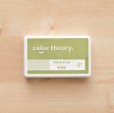
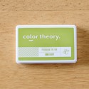
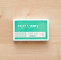
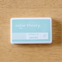
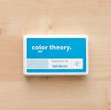
But the way I would describe the new greens is that Going Green is more your lighter grass green, Glass Slipper has a touch of blue so is probably described as a pale aqua, whilst Lime Light is a vibrant yellowy-green.

And since I was on a roll, I thought I'd do a little chart for the pinks and purples as well!
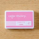
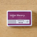
Flamingo and Purple Rain are the new additions and as you can see they don't really compete at all. Both of these are nice and bright and have quickly become some of my new favourites. I've already used these a lot, and Flamingo especially made it onto many of my October kit layouts.

I should also point out that I'm not a stamping expert either. I wasn't aiming for these samples to be perfect, I simply wanted to compare the colours and to see how they worked with a solid image, outline image and words. I've used the stamp set out of this month's Notting Hill Add On and stamped them onto watercolour paper (which is not a true bright white). But it does the job and I think I'm going to be referring to these a lot in the future.

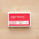
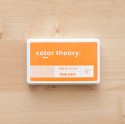
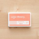
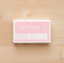
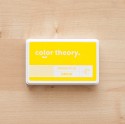
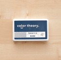
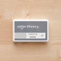
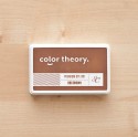
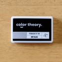
The Whole Collection (so far.... !)


Wow those colors are so lovely.. thanks for sharing!
ReplyDeletethis is great. thks!
ReplyDelete