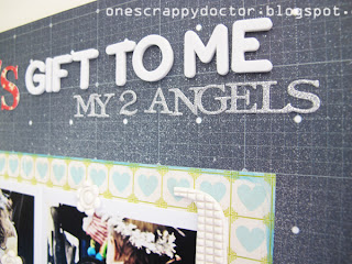
I don't often do a clean and graphic layout. I'm a bit adverse to doing straight lines and graphs and the like. Whenever I try I can't seem to stop myself adding some splashes of paint, haphazard embellihments or something just a bit off-kilter :-)
So that's where this layout ended up. I was inspired by this month's movie poster at 'From Screen 2 Scrap'. It's a very graphic poster, trying to push me to do a layout that's all straight lines and squares.
And I did a pretty good job of keeping it that way. I just couldn't help spraying Maya Mist in the background to soften it a little, and threw around some Pink Paislee Artisan Elements.
I wanted to keep that big red bow in my layout (not least of all because it's one of the extra criteria for the challenge!) but because it represents how I've wrapped up my kids like a giant present. They're God's gifts to me :-)
The other criteria for the challenge so you can score full points is to include a journaling note, and to add people's names to their photos.
So you can see it's a very easy challenge this month. I would love it if you were to join in (and if you were to tell Shazza I sent you!). We've got some amazing prizes as usual, including the chance to win a shopping voucher to my very own favourite store Handmade by Suzanne!


This looks fabulous and I can certainly see the inspiration in your LO. I love the misting, it finishes it of beautifully.
ReplyDeleteFabulous layout the photos are precious!!!
ReplyDeletethis is just so lovely natalie, the colours are soft and beautiful and perfect!
ReplyDelete