Pages

Sunday, October 31, 2010

Here's Looking at You Kids

The movie poster used for inspiration this month at From Screen 2 Scrap has been requested so many times we've lost count. It is, of course, the classic "Casablanca"


To take part in this month's challenge and be in the running for one of many prizes all you have to do is create a layout using this poster for inspiration. And for added points you can include these optional criteria:
  • An airplane somewhere on the page (1 point)
  • Two colours in the title (2 points)
  • Two photos, or two figures cut from a photo (3 points)

And this is my DT submission for November. Usually I use the movie poster as a sketch to base my layout on, but this month I've just used the general theme of the movie (being love) which made it ridiculously easy to make a page about!


I managed to include all 3 optional criteria this month, and you can see them all here in this close-up. See the cute little folded airplane flying through the sky? And the red and yellow alphas in the title (Cosmo Cricket and Kaisercraft respectively) and my two cute little angels cut from the photo.


The journaling is a quote from my grandmother (the girl's great-grandmother) who once said to me "Whenever anyone asks I always tell them I have two sweet great-grandchildren. I call them 'gumdrops' and 'lollipop' " I thought that was very cute, and quite lovely so immediately jotted it down to use on a page somewhere...... voila!

Lots of delicious Cosmo Cricket Togetherness on this, including the luscious chipboard shapes. And the kraft background is by My Mind's Eye. I've linked you up to where I got them from - some of this is on sale for ridiculous prices!

Anyway, go on over to the FS2S blog to check out what the other DT girls have done and all the details for how you can play along too.

Friday, October 29, 2010

An Oopsie

when I accidentally left the camera outside overnight.

It rained.

No more camera :-(

So although I have a few more projects sitting on my desk waiting to show you I'm afraid it's a bit impossible to do that right now.

However, I choose to see the positive side. My husband ordered us a brand spanking new camera today which we should get next week. And like all these things go, it will be better than the last one.

In the meantime, here's a couple of old old things that have been sitting in my "unshared" folder for goodness knows how long now.


A couple of cards, and a sneak of a project that I can't yet share......

Wednesday, October 27, 2010

Mixing and Mending it

I did a little happy dance when I opened my DT package this month and found I had the privilege of working with the extraordinary Mix and Mend Collection from Sassafras for October. This was my absolute favourite new release from CHA and couldn't wait to get my hands on it. But I've heard a lot of people who are apprehensive about it - not being sure what to do with these 'digital' papers. Because despite looking so dimensional, they are obviously quite flat in real life, and the minute you slap a photo on them this is accentuated.
So I wanted to share a few hints and tips with you from my experience working with the collection this month.

1. Put the texture and dimension back into the papers

You can use your scissors or craft knife to cut around some of the designs in the paper, and then 'lift' them up so they jump off the page again.


Or another trick is to layer back on the materials that are used in the design. For example, where there is a strip of lace - add your own lace on top. Where there is a punched border - add your own.


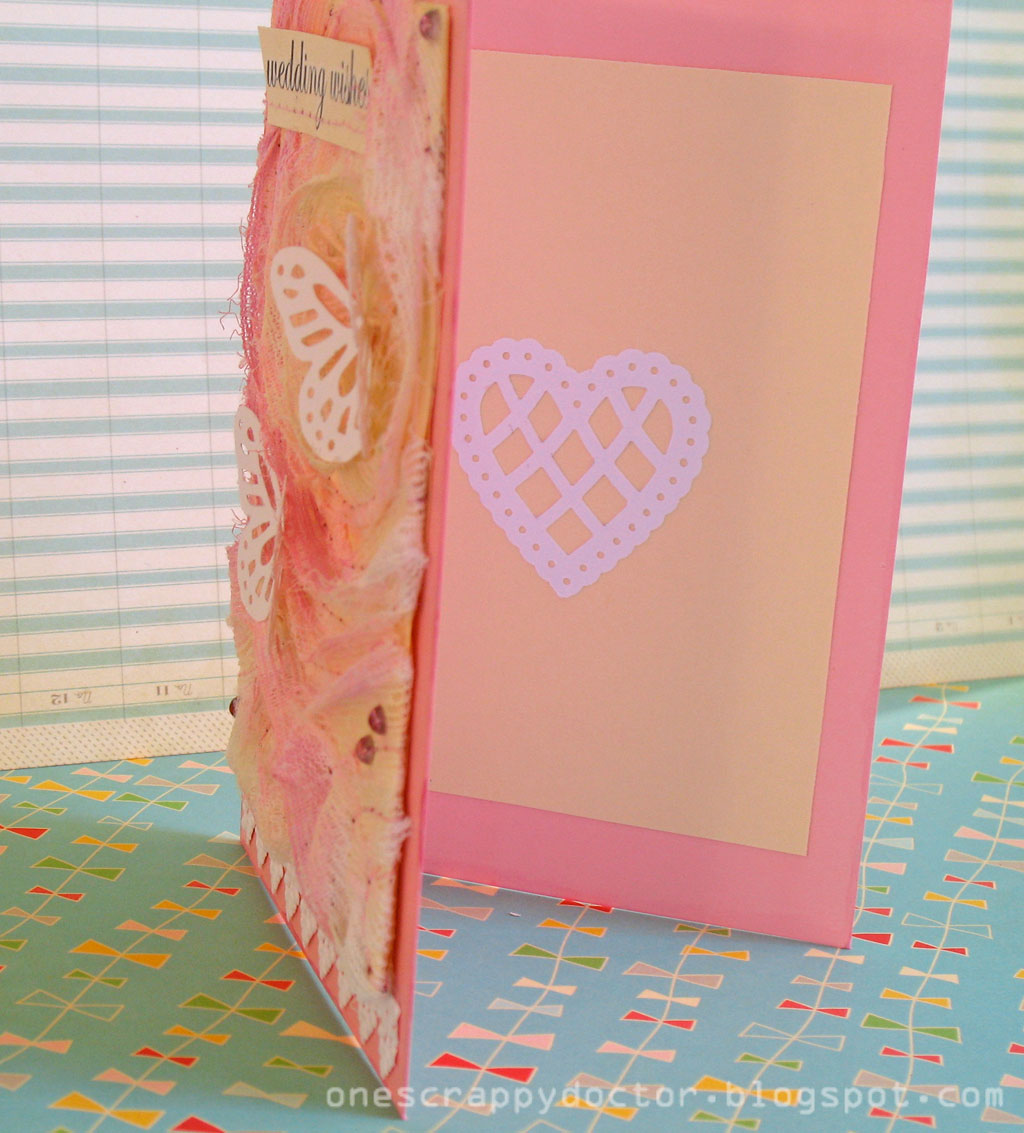
The lace I've used here is by Prima - you can leave it white or add some extra colour to it if you want to :-)

2. Use Layered Embellishments

To further enhance how textured and dimension the papers are, you need to
ensure you use textured and dimensional embellishments too.

The Sassafras In a Stitch Blossoms are perfect for this as you don't need to do anything extra to them, and they coordinate perfectly. In fact, they worked so well I splurged and totally used the whole packet on this one layout!


Alternatively, the Chipboard stickers can be easily layered - either on themselves or with other embellishments.


Here I've layered them on some Green Tara flowers, which all started off white before I added different colours to them. And bakers twine is from Jillibean Soup and is just gorgeous for adding further dimension.

3. Paint, Ink and Mist are your friends!!

In the papers themselves there are a lot of ink-splashes, stains, and paint strokes etc. So to carry this theme forward and to create unity you need to do the same to whatever you add to your layout.


You can see in the background of this one I have roughly painted on some cream acrylic paint, followed by some splatters of blue paint, and splashes of orange Glimmermist.


The background of this one started off as white cardstock, then I lightly sprayed some cream mist in places, followed by some stamping with bubble-wrap, then some glue-dots covered in glitter.


And don't forget to add the same treatment to your embellishments too. The Prima lace here started off white (until I spilt my Glimmermist all over it....... happy mistake!) And the Green Tara flower and yellow ribbon also got some splashes of colour.

4. Let Michelle guide you

This is perhaps really the only point you need to keep in mind.
Michelle Alynn Clement is the talented woman who designed Mix and Mend for Sassafras, and this collection very much reflects her personal style. So while you need look no further than the papers themselves for all the inspiration you require you could also stop by her blog for further eye-candy, and this blog post gives you an insight into how she created this line.

So what I mean by this is let the design elements inspire you.
For example, as in Part One and Part Three - there are lots of fabrics and papers and lace you need to be adding, as well as inks, paints and sprays.
But don't forget it also heavily features stitching... both hand stitching and by machine.


I did all my hand-stitching on these layouts with the bakers twine by Jillibean Soup that's in the store.


I got out some blue thread for my machine to stitch on nearly everything in sight.


And if you know me, you'll know that I quite often stitch on my journalling anyway so this was no big challenge for me me.

Ok, that's it for me. I hope I've been able to quell some fears about how difficult it is to work with this line because with just a little bit of extra effort it's easy to get some fantastic looking results. You can see my finished layouts (what I've done so far anyway... I'm still tempted to play some more!) in the new and improved gallery - including my take on the October sketch.

I hope I'll see some more Mix and Mend layouts in there real soon!

Monday, October 25, 2010

Beat It

Yes, this is like my second layout in two days with pictures of my little Munchy asleep. And both of them featuring the delightful Restoration collection from Crate Paper. And yet, they do look totally different don't they?

I snapped this shot of Munchy asleep at the computer a couple of months ago when she had only recently given up her afternoon nap. She insisted she wasn't tired and was watching some Sesame Street on YouTube while I scrapped behind her. After a few minutes I turned around and found her like this! The need for sleep had beaten her :-)


So I am loving the colours and designs of those flowers and had to cut nearly every single one out to add a few layered up in this embellishment cluster.


And I couldn't resist adding some glitter to this strip of paper cut using my new border punch. I know I know it doens't quite match, but I couldn't help myself. I told you I have just discovered this whole glitter sensation and now it's becoming a bit out of control!

Saturday, October 23, 2010

Sleepy Head

Sometimes all it takes is a great sketch to get the creative juices flowing hey? So I played along with the sketch challenge at Crate Paper this month and created this layout.


Of course, you had to use mostly Crate Paper products. But that's not really too hard for me... I have a tonne!
This was the sketch we had to work on:


Can you believe I have never done a proper grid-style layout before? Maybe because it seems too 'graphic' and 'clean lines' for my messy and embellished style. And yet, I was super happy with how this page turned out because I was still able to add some of my own touches.


Like lots of very messy stitching, and a splash of paint behind every square to soften the harsh lines.


I think I must have used scraps from about 4 different collections here, but of course, the vast majority of it is from the beautiful Restoration collection.

And you know what? This has really given me a bit of a kick-start. I'm putting together another grid-type layout today too!

Thursday, October 21, 2010

My August layouts

Playing catch up I am! And I don't mean I'm only just posting these to my blog, I mean I've only just finished my August layouts this week for my Year in the Chair Album.

Here they are:


First up, Moodles at 9months. It's great being able to look back at how these photos (and my scrappiness) has changed so dramatically over this time. At the end of the year I'll do a post where I compare either all the photos or all the layouts so you can see for yourself!


As you can see, I've used the amazing Crate Paper Restoration collection for the August layouts. I get mine from here.  And keeping true to form I've used my Studio Calico months stamps. That's one of the only things staying fairly constant throughout the album.


Oh my goodness, I'm finally beginning to discover the joy of glitter!! Mainly because Spotlight was having a huge sale on all the Martha Stewart stuff and I bought 4!!  I also bought her Hydrangea punch. So I combined the two for a little flowery accent on this page.


And the photo of my two sweet girls together. 


The Man did ask "what's with the cards?" and I don't really have any insightful answer. They don't represent anything or have any meaning (unless someone can suggest something to me?!!!) they just seemed like a fun and dimensional embellishment! 


I always like to keep some journalling of the things that have happened, or the milestones reached in each month on these layouts. I think that will be one of the most important things in time to come.

Tuesday, October 19, 2010

Stoked

Isn't it funny how sometimes the layouts that you're really happy with don't seem to get the response from others that you think they deserve, and yet other times you're not sure about one and everyone praises it?!!


That's what happened to me with this layout. This was my fourth layout from the Sassafras Mix and Mend collection that I was sent from Handmade by Suzanne so I was getting a little low on supplies and ideas. Luckily for me I had the fantastic October sketch in front of me (designed by Michelle Fowler) so that was part of the solution. But it still took a while to put it all together in a way that I was happy with, and I just wasn't totally convinced in the end. And still, it's received nothing but high praise in the Gallery. Funny isn't it?!


Once again I've journalled about my Munchy's obsession with picking flowers. Any flower, any where... if she sees it, she will pick it. She doesn't discriminate between weeds in the gutter, the only camillia on the tree, all the strawberry blossoms on the plant, her garden or someone else's garden!


I do like layering my embellishments! The sketch really called for some long and curly ribbon and lucky for me Suzanne had included some gorgeous satin ribbon in my kit which was just perfect :-)

Why don't you have a go at the sketch challenge yourself and maybe win a generous voucher to the Handmade by Suzanne store? Plus there's a big sale on at the moment so you could make your winnings go even further than you imagine!


Oh yeah....

I couldn't be more stoked about THIS!!!! Yay!! Go and check it out and maybe win yourself some brand new Sassafras products!!

Monday, October 18, 2010

Keep watching

I sat out in the lounge room watching the TV while I put together the basics of this layout. The Man made a comment about the migration of my scrapping materials which can now be found in most rooms of the house. I just said that he should be grateful I was being so social instead of scrapping in solitary.

I first cut out the centre of the Free Composition paper and backed it with the orange polkadots from Fancy Free instead. This allowed me to add the lace around the border for some extra texture. I was all about adding more texture and dimension to these papers since they appear that way - I wanted them to look and feel that way too.


Now I know the butterflies and the hand-stitched trails are subtle - but that's what I was going for. The journaling is a quote from Roald Dahl which is about keeping your eyes open and looking for magic, so I wanted the butterflies to be a little bit like discovering some of that special magic if that makes sense?!!

It was so easy to add a whole bunch of layered embellishments for some quick decoration and dimension. Here I've used some Green Tara flowers (which began life as white but I coloured them with varying shades of Glimmermist), Sassafras chipboard stickers, Prima flowers (the small ones) and tied off with some Jillibean bakers twine.


The alphas I received in my package were from Kaisercraft and they coordinated perfectly. Both the journal spot behind my title and the small border strip are from the 12x12" journal tags sticker sheet. You should add that to your shopping list!
These papers screamed out to be used with some vintage style photos, so by the magic of Photoshop I changed the colour / saturation / filter etc of these pictures of my Moodles and then cut them down and matted them on white to mimic the look of old-style polaroids. I think they work well.

Saturday, October 16, 2010

Not so stuck

I've managed to join in on one of the challenges at Stuck Sketches this month. It was mainly due to the fact that I was so inspired by the October 1st sketch. I knew I needed to do something with it, so this is what I came up with.

and here's what the sketch looked like:


Pretty much every one of the DT examples and participants to date have used the large white rectangle to represent thier photo, and the 3 smaller sqaures to represent embellishments. Which was funny to me because I immediately thought it to be the other way around in my head. Hence I used the larger space on the left for my title and journaling, and the smaller spots of the right for my photos (but I only had two, so I had to make the third into another journaling spot)

I just bought a new border punch which I adore and I couldn't help but add a little sample to this page.

After just recently complaining that I've only made one layout from my Studio Calico Continental kit I thought I should make more of an effort, so all the supplies on this are a mixture of the Continental and Partly Sunny kits.

I'm afraid sometimes I'm not very good or original at making up titles, and since I couldn't fit in a very long one I had to settle with some initials here. P and M stands for Poppy and Moriah and the journailng is about how my Dad was quite apprehensive with handling babies when Munchy first came along, but he quickly settled into the role and now he's nothing but the caring doting grandparent. It's very lovely to watch.

Thursday, October 14, 2010

It's Astounding

Oh the fabulous Mix and Mend collection from Sassafras! How I love thee!!!


I've been trying to figure out my style lately (with minimal success I might add!) but what I do know is that I continue to be attracted to paper ranges that are vintage inspired. And I also know that when I put my pages together I love to use layers of paper, fabric, tape, lace etc, and I also love to splash a little Glimmermist around and sew lots of elements on. The Mix and Mend collection has taken half of this hard work away from me, and made putting together a layout like this sooooooo easy!


For example this looks so much more complicated than it really is. 3/4 of those layers are actually incorporated in the design of the paper so all I've done is simply cut a square from Free Composition and stick it down! But I did go back in and add some texture by sewing a couple of my own layers over the top and adding some chipboard shapes too.


I've posted a quick series on the Handmade by Suzanne blog about some hints and tips on working with the Mix and Mend collection (which you can see here) but one of my tips was to try and incorporate lots of subtle layers in your background too.

On this plain white cardstock I misted with cream mist, stamped some green Twinkling H2O's on with bubble-wrap, stamped the Studio Calico doily border stamp in blue ink, and added some glitter to glue dots stuck randomly on the page. I'm quite pleased with the result.

HBS has a 25% off everything sale at the moment as we get ready to launch a new and improved blog. Maybe you want to take advantage of it to grab some Mix and Mend? Or any of the other great bargains in the store!

Tuesday, October 12, 2010

Not Always Easy

I have to admit that although I am loving the fact that I'm finally signed up for the Studio Calico kits, I wasn't that impressed with the second kit I received which was 'Continental'. But I know that you can't suit all the people all the time, and when you subscribe you have to expect that you're not going to adore every single kit. So I've only made one lone layout so far with this kit - and it was months ago. (And never fear because the next three kits after this one have been incredible and I can't wait to get my hands on them. I haven't got them yet because of the arrangement I've made with a friend as we subscribe together...... long story!)


However, it did come just at the right time for something. I had just been cleaning out the closets in order to pack and move houses and came across some long lost photos of me from high-school. For example - this photo is our Year 11 Chemistry class (that's me second from the right in the back row). And the colours in these Girl's Paperie On Holiday papers and the general theme of the kit were absolutely perfect! I was also really happy with the fact that I had just purchased the notebook punch at the same time - another perfect embellishment for this page!


Umm.... yes... I didn't realise my 'A' had shifted when I took the photos of the layout until I uploaded them :-)

And I'm impressed with my own cleverness at cutting out those numbers from the paper to incorporate into the catchy title from the Jackson 5ive song "ABC, it's easy as 1,2,3"

But overall..... still don't really like this layout.
Oh well. You win some, you lose some!!

Monday, October 11, 2010

Etsy Inspired

It's been a while since I played along with Etsy Inspired Challenges so it's about time I gave it another go!


I made this card after checking out all the wonderful pieces from Lemon Kissed's shop and choosing these beautiful earrings to inspire me. 


I interpreted the earrings into white ruffles (which I then promptly altered to cream with pink highlights) and added some 'filigree' butterflies to top it off. 


A very girly, soft, romantic wedding card, that's for sure!


And a little detail inside too :-)

LinkWithin

Related Posts with Thumbnails