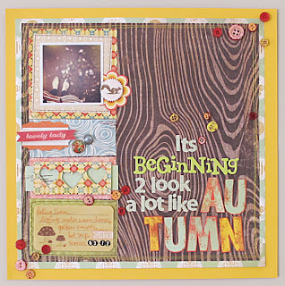
Meanwhile, I was super-inspired by all this sketch lovin' and went and found a few more, this time over at Stuck Sketches. And using my old "Into the Woods" Studio Calico kit I quickly whipped up this layout.
The sketch looks like this, so you can see I had to change it just a little bit for my purposes.
I feel like all I'm scrapping lately is my Instagram photos, but honestly it's all about my real life. These days 99% of my photos are taken with my i-Phone and all my favourites go into Instagram, so when it comes time to printing then that's where I start. If you want to see what I'm talking about, then check out my feed here.
Not sure I quite captured the vision that was in my head, mainly because of that slightly questionable title-work. But I really love the colours in this. Those warm autumnal colour-schemes get me every time - and the blue is a fresh new twist but I think it works?
Well, I gotta go pack for the holidays. But don't worry, I've got a whole heap of outstanding projects to share with you whilst I'm gone.
That's outstanding, as in, 'overdue'. Not 'fabulous'.
They might be fabulous...... but that's for you to judge :-) We'll see.
ETA: So I kept thinking about the reasons why I was dissatisfied with this layout and eventually got the courage to rip up most of my title. I felt it was too distracting. Here's the new version:
Tell me what you think. Long title or no?


Love the "fresh new twist"! Look forward to seeing your outstanding projects :) Enjoy your Easter holidays!
ReplyDeleteI actually love both versions. I like the long title on the first LO but I love that you can see more of the wood pattern on your background papers on the second :)))
ReplyDeleteI think i prefer the longer title...just seems to make it more fun!
ReplyDeleteI thought it looked great with the long title, but when I see the shorter title I think I like that better. There is so much going on with all the patterns I like the simpler title.
ReplyDeleteLove your layouts!
Well I found it hard to choose between the two as well but I think I am with Pink Heather....loved the first but loved it even more for the second one!!! Thanks for playing along with us at Stuck sketches :)
ReplyDeleteSo cute!!
ReplyDeleteI love your using heart punch.
I think that the long title is good:)
Thanks so much for playing along with Stuck?!Sketches!!
Gorgeous...both of them...awesome take on the sketch...thanks for joining us at Stuck?!Sketches!!
ReplyDelete