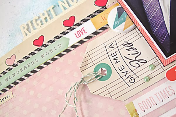
Well... this is about as romantic as you're going to get from me! I still prefer my pages to have more of a graphic layered effect than a shabby chic look, but you could just as easily go that way too. I began with white cardstock and created some mixed-media effects in the background with stamping, modelling paste and mist. I find this gives me lots of texture without creating too much bulk, and it's a chance to get more complimenting (or even contrasting) colour onto the page. You can totally take a collection to different level by using varying colours, but here I chose to stick with the mint green.
After creating a basic structure to the page with the gorgeous pink Fine China paper and the hearts from Treasure, I cut the Heirloom paper into all it's various tags and strips and layered pieces of them on top. I love that manufacturers are making papers like this that effectively give you a tonne of embellishments at very little cost.
But speaking of embellishments, they don't get more luxurious and decadent than the gold pieces out of the Adhesive Chipboard sheet. Pure love! I used the "Me & You" banner pieces (and turned the phrase around so I could create my rhyme) for a title and placed the little gold hearts in the opposite corner to create some balance. I think if you're going to use gold you should limit it to just one or two areas otherwise it can become quite overwhelming. But as a title it makes quite a bold statement!
I'll be back real soon to share some more adventures with this stunning collection. Just you wait to see what I've got in store for that Gold Doily Vellum!!


This turned out beautiful! I love it!
ReplyDeletebeautiful..x
ReplyDeleteWhat a fabulous layout! Love the gentle colours and the lovely pic.
ReplyDeleteYup! Fabulous as always....& that gold title really does stand out....as does the rhyming.....I like a bit of rhyme, I must say:):):)
ReplyDeleteI love how you worked this into your style. And came out beautiful! Loving how you built your background too!
ReplyDelete