First up was the layout sketch which looks like this:
It's drawn as a 8.5 x 11" layout, but was easily interpreted into a 12 x 12" style. I'm a fairly literal interpreter of sketches, and I tend to follow the
design pretty much exactly as it's drawn. I love the clean lines and
central placement of this sketch and wanted to keep that the focus in my
layout.
But I still like to change around a few of the details, just so I can make it my own. I shuffled the placement of the photo and text block so the photo was at the bottom, and then instead of filling in the middle space with journaling I filled it with patterned papers instead.

I took direction from the colours in the photos to choose which papers to use, and ended up with this mix of brown, green and beige from The Underground Main Kit. Ultimately I really am a journalist at heart as well so I still included the block of text, I just hid it behind my photos instead!
You can pretty much read the story here for yourself if you're able to interpret my handwriting?!
Next up was the card sketch:
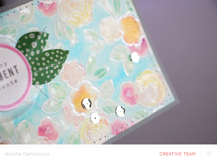
I love that this allows room for so much interpretation. You really could make this fit any theme and any style you wanted... which is exactly what I did! As you may have noticed recently, I fell in love with the flowery stamp set from Piccadilly and once again wanted to make that the real focus of this card.
I stamped it repeatedly on white cardstock and embossed it in white also. At first I thought I might leave it like that. You know, a real tone on tone look? And then I thought I'd just add one soft colour, like painting in the leaves with Going Green. Which I did. Then I thought perhaps just one little pop of colour in the flowers, maybe I should add the Sunny Day? So I did that too. Next thing I knew the entire image was coloured in this rainbow of Color Theory Inks! Plus a touch of Wink of Stella over the top for a hint of sparkle too!
By this point I figured it just wouldn't be fair if I didn't do the Project Life sketch, so I gave that a go too!
I have to admit, I always find these sketches just a little bit difficult to interpret. I figure it's just supposed to help you with one card for the spread? Since I'm doing a Handbook for my Project Life the amount of pockets I have to fill for each spread is more limited anyway, so I was able to turn this sketch into my main title card for this simple page.
I started with one of the 6x4" cards from The Underground PL Kit which read 'Harvest' - clearly not what I was going for with this photo! But that was easily fixed by covering it up with a punched circle and the stamp. On the other hand, the washi tape from the Chelsea Add On really was perfect in both its theme and colour, so it became the anchoring point for my title. The brads and puffy diamonds was just the right amount of texture I was after to finish this off.
Now it's your turn! Make a project using one of this week's sketches as a starting point, then share it in the Studio Calico gallery. The post with all the details is here, and that's where you need to leave a comment with a link to your project. You've got until November 3rd to be entered to win a $5 GC to the Studio Calico Shop.


These look wonderful, you were on a roll!
ReplyDeleteLove the colouring on the card.
ReplyDelete