Happy reveal day! The Studio Calico Walden kits are here and they are fabulous! If you've been feeling like the colours in the past kits haven't been quite your thing, or perhaps even a little light on with the embellishments then this month is going to blow your mind. The Main Kit is choc-a-block with exclusive products such as a Wilna Furstenberg stamp and vellum leaves, and our favourite rubber alphas are back in grey!
Here's my first Main Kit Only layout. I stuck with a green, blue, grey colour scheme which fit this underwater theme quite nicely, and splashed about some Gelatos and water-colours (pardon the pun!) to create a similar feel.
Look at those colours! Makes you just want to jump in a pool doesn't it?!
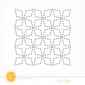
It's a bit hard to see in the full layout photograph but I've also used this background cutting file to stencil in some extra texture in the background. It looks much better in real life - makes me want to run my fingertips over it every time. Like it's some kind of braille :-) You can catch a glimpse of it in this detail shot though...
My second Main Kit Only layout also wasn't in any way Autumn-themed. I mean, the main kit is filled with lots of greens, reds, tans and blues - inspired by the natural tones of the countryside. But I took it in a much more tropical direction by focusing on the splashes of orange.
Anyone been to The Big Pineapple recently? I visited as a child, and then after an absence of perhaps 20 years took my girls to see it on our holidays. Ummm..... so it wasn't quite like these romantic memories I had in my head from back in the 90's. But I guess these things never are ;-)
Taking inspiration from the pineapple photos I folded these little paper squares to mimic the skin. Yes, I thought initially about how technically they should be hexagons but really... that was going to be much harder! I swiped a little bit of gold and orange acrylic paint over them for some highlighting too. I kinda love it! Something a bit different hey?
Next up is my double page spread for the month. If truth be told, it actually started off just as a single page. As in, I started and finished it all as just the left hand side. And then felt guilty for not including enough photos or journaling so decided to go back and add another page to it (which still failed on the journaling front, but at least got 6 more photos included!)
My big inspiration for this one was the 'Today' card from the Baker Bridge Add On. I wanted to try and recreate the same colour scheme on my background paper and so once again reached for my Gelatos (they got a lot of love from me this month! I'm so happy I got the 34 colour set and not the smaller version) I think I've managed to match it pretty well actually. My title comes from one of the digital stamps converted into a cutting file. It comes in this bundle which is so cute:
My fourth layout uses mainly the Concord Add On (with a bit of the Main still mixed in). This kit has certainly more of that girly vintage vibe that is my standard fall back... although I have a suspicion that might be about to change a bit in the future ;-)
So I finally got around to scrapping one of the pregnancy-announcement photos we took 6 weeks ago! The colours in the photo were perfect for this kit, and the little bits of cutesy like that fox badge, and the cloud paper worked well too.
And despite the fact that me and hand-stitching generally don't really mix (which is ironic really.... given I do soooo much of it in real life!) I was excited to see the embroidery stencil in the Concord Add On too. I even thought I might actually do it. But once I counted up that my title had 12 letters in it I had second thoughts and figured I could just get away with this cheat version instead ;-) I still punched the holes, traced around them with a Precision Pen and painted in the rest with a coat of gesso and then... yep.. you guessed it.... more Gelato action!
My fifth and final layout for reveal was a Christmas one. It's the first Christmas project I've made this season and it's awoken my love for holiday scrapping again. Might even prompt me to tackle my
But yes, I would consider the Pine Hill Add On to be my favourite this month. Every single bit is perfect, from the mix of papers to all those fun embellishments too. I mean, you've seen the masking tape right? The deer though is actually from the Main Kit - I just added the antlers and red nose separately to make him into a little miniature Rudolph. Super cute, and keeps my reindeer obsession burning bright.
You can see all my layouts (including more detail shots) and a more comprehensive supply list in my Studio Calico Gallery here, but I've also linked up my most used products below as well.
Earlier today I posted what new products made it into my shopping cart this month in case you're interested too ;-)
Oh and I can't believe I nearly forgot! Here's my unpacking video for the Walden Kits. And by "my unpacking video" I really mean "The Trophy Husband's unpacking video" because he's taken over again this month! This is most certainly the most product-ignorant colour-blind walk through you'll ever get. Just be aware!
Happy Scrapping,
xx

Supplies:





Nat you are killing me...you make me want to buy everything!
ReplyDeleteHilarious video - especially the bit ''We only have that critter and we shoot 'em!'' Lol. I now have stash envy...
ReplyDeleteLoved his unpacking the kits version.
ReplyDelete